Easier collaboration for OpenAustralia Foundation projects

the Baracktocat

It should be simple for anyone to get involved in helping create an OpenAustralia Foundation project. After all, that’s what our projects seek to do to our democracy – make it really easy to get involved.

Today we’ve made a solid step in that direction. We’ve moved our entire issue tracking system to GitHub Issues. This may sound pretty boring or technical but every step that lowers a barrier to entry is important.

If you were put off by our complex issue tracker or found it too confusing before, maybe now is the time to try getting involved again. It’s such a rewarding way to get involved in Australia’s democracy and a seemingly small contribution can have a big impact.

I’ve posted some of the technical details of the move to the mailing list. Here’s where our projects live on GitHub:

I’m really looking forward to working together using GitHub. Why not dive in and open an issue, or better yet send us a pull request!

Cheers,

Henare
OpenAustralia Foundation volunteer and GitHub lover

Posted in Development, ElectionLeaflets.org.au, OpenAustralia Foundation, OpenAustralia.org, PlanningAlerts.org.au, Projects, RightToKnow.org.au | Tagged , , , , | Leave a comment

An experiment in visualising preferences

Employee with slide rule, Hercules Powder Co. Experiment Station, Wilmington, DE

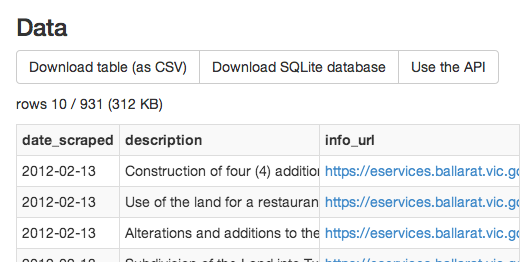
A little over a week ago the Australian Electoral Commission (AEC) published the preference tickets for the Federal election. Every party has to lodge with the AEC how they would like their votes to be distributed for people that vote above the line in the Senate.

Of course, this is of fascination to political insiders, because preference flows can make the difference between winning and losing a seat. But to normal people, it’s virtually meaningless.

My guess is if you’re the kind of person that would look at how the parties are selecting their preferences you’re also the kind of person who might vote below the line. If all seems like it’s too geeky and too complicated, then voting above the line is the way to go and you’re leaving it to trust that something sensible happens with your voting preferences.

For the first time this year, on Sunday, I found myself looking through the preference tickets. I wanted to check for myself what people on Twitter were saying about how the Wikileaks party had preferenced.

You’re confronted by pages and pages of boxes with numbers. Here’s just one of 105 pages showing part of the Carers Alliance ticket and this just for New South Wales.

ticket

Something really struck me. This is an invaluable source of information, yet it’s almost completely indecipherable. There are so many candidates and parties. So many relationships between parties, both public and hidden but in these preferencing arrangements it’s all there. It’s just a matter of squeezing some meaning from these pages and pages of boxes with numbers.

I was reminded of the Eurovision Song contest.

Eurovision isn’t really about songs. Well maybe it is. No, it is about songs, but who wins and which countries vote for which other countries seems to have very little to do with the songs. It’s a fascinating insight into the shifting relationships between european neighbours, that mixture of politics and geography.

Something I’ve been wanting to do for years, but never quite managed to find the time to do is to analyse the voting behaviour and visualise the result in a very specific way. The idea is as follows. You look at how one country votes for another country. You use that vote to create some measure of “distance” between the countries. In this case, the higher the score they give each other, the lower the distance between the two countries. Then, with the distance data, would it be possible to create a new “geopolitical” map of Europe? It would show the countries arranged so that the distances between them map to the distances calculated from the Eurovision Song contest scores.

Where else do you get to see every country voting on every other country. That is such a rich data set.

You only have to look at Turkey’s chequered Eurovision history, including minor scuffles with Greece to see this happening.

How would this geopolitical map compare the physical, normal map of Europe?

How would this map change over time?

I think this would be fascinating to look at. I hope I’ll get there one day (unless someone’s done it already, of course!)

The Setup

Back to Australia. What if we applied the same idea to the voting preference data?

We can create a map that shows the relationship between parties. Parties that are close on the map have preferenced each other above those that are further away.

At this point I’ll get into some nitty gritty of how I went about getting the data and transforming into a form where it could be used to generate a map. We’ll start with a simplified example so you can follow through the reasoning. The punchline comes towards the end of the post when we apply the technique to the real data.

First off a big thank you to Benno Rice, from belowtheline.org.au, who has already done the job of gathering the vote preferencing data from the AEC and republishing it in a sane digital format.

If you haven’t yet looked at his site, please do. It’s really important. It makes it much easier to vote below the line by allowing you to reorder the candidates in your browser and then print out a personal PDF with your choices that you take with you to the ballot box.

Let’s first dive in with some made up data and a simplified situation. So, let’s for the time being ignore the fact that groups, which can consist of multiple parties, preference individual candidates. Let’s just say that parties preference other parties.

Say you have four parties A, B, C and D that have preferenced other parties as follows:

Position A B C D
0 A B C D
1 C C A C
2 B A B A
3 D D D B

(table 1)

In each case the party has preferenced their own party first. No surprises there.

Our goal is to assign “distances” between each party based on their preferences. Party A has a preference order of A, C, B, D. The first party A, we’ll assign a distance of 0. The second party C a distance of 1 away from A.

Following that through with each pair of parties and arranging that in a new table we get the following:

distances A B C D
A 0 2 1 2
B 2 0 2 3
C 1 1 0 1
D 3 3 3 0

(table 2)

There’s one last thing we need to do to make this table work. That matrix should be symmetric. In other words, the distance from B to C should be the same as the distance from C to B. That’s how real distances work so we need our measure of distance to do the same.

Ideally it would be great if we could tweak the distance numbers so that the matrix becomes symmetric and we keep the absolute ordering of the items in the list.I couldn’t figure out an easy way of doing this. So, instead I opted to do the dumb thing which is just average the two distances, which for the matrix means taking the matrix above and averaging with its transpose. That will give a symmetric matrix.

What that means intuitively is that the distance between two parties is equally affected by the relationship in each direction.

symmetric distances A B C D
A 0 2 1 2.5
B 2 0 1.5 3
C 1 1.5 0 2
D 2.5 3 2 0

(table 3)

Phew. Nearly there.

So, now how do we find points given the distances between them? I’ve known about a bunch of ways of solving this for a while but I found a new one in the course of looking at this and it’s already implemented in the R statistics package. The technique is called multidimensional scaling (MDS) and essence what it does is find points (in a given dimensional space) that overall best match the given distances between them.

There are a few variants of the method. The most important distinction is between metric and non-metric multidimensional scaling. Metric MDS tries to fit the distances as best it can, treating the distances as the exact distances it’s trying to fit. Non-metric MDS just tries to maintain the order of the distances. In our case, we’ve made the distances up based on an order in a preference ticket. So, non-metric MDS is the obvious choice.

There’s an infinite number of solutions that are just translated or rotated versions, but we’re just interested in finding one.

Example result

What’s fabulous about this is that it’s turned a bunch of abstract numbers on preference tickets into something tangible and comprehensible. You can now see the relationship between the parties.

Right away you can see the importance of party C. It’s being highly preferenced by the other parties. Of course, you can easily see that from the table. We’re just demonstrating a point here.

Look at the preferencing between parties C and D. From table 1 you can see that party C is preferencing D last while party D is preferencing C first. Remarkably this can be seen in the calculated layout of the parties. D is the furthest away from C while the situation is very different for D where C is the closest of the parties because it’s sitting there on its own out on the right.

To really have confidence that this makes sense, let’s go back and figure out the preference tickets from the coordinates of the parties that we’ve calculated. This is just a consistency check.

First thing, using the calculated coordinates we calculate the matrix of distances between the points.

fitted distance A B C D
A 0 1.7 0.7 2.6
B 1.7 0 1.2 3.0
C 0.7 1.2 0 2.2
D 2.6 3.0 2.2 0

(table 4)

This matches up reasonably well with table 3. Since we’re using non-metric multidimensional scaling we wouldn’t actually expect this to be the same. Now given those distances what would the preference tickets look like with each party voting for the other parties in order of how far away they are?

A B C D
A B C D
C C A C
B A B A
D D D B

(table 5)

And you know this is exactly the same as table 1. That means this has worked. Woohoo!

Applying this to the real data

The real world Senate preferencing data is of course more complicated than the simplified situation we just went through.

  1. Not every candidate is a member of a party
  2. A group might have several independents or parties in it
  3. Groups preference candidates not parties
  4. A group can lodge several tickets

The first one is pretty easy to deal with. We’ll just completely ignore independents. We’ll effectively remove them from the preference ticket before we do any of the other calculations.

2. only happens with the coalition. So, there we treat all the parties that are members of the coalition as being members of the “coalition” party.

3. is a little more complex. Say a party (A) preferences candidates as follows:

Position Candidate Party
0 Alice A
1 Bob A
2 Carol B
3 Dan C
4 Eve B
5 Frank D

(table 6)

Their parties are shown in brackets. I started off by taking the average position for each party. In this case that would be:

Distance (from Average Position) Party
0.5 A
3 B
3 C
5 D

(table 7)

But doing this has a couple of problem. First if a party has multiple candidates that it puts first then it will end up with a non-zero distance to itself. Not good. The second issue is that the number of candidates in a party will affect the overall distances. The more candidates the further away it will be.

A better approach is to only consider the highest preferenced candidate for each party. That gives the following positions. The number of candidates makes no difference to the distances

Distance (from first position) Party
0 A
1 B
2 C
3 D

(table 8)

Issue 4. is handled by simply averaging between the multiple tickets.

The Results (The Reveal)

Using the ideas from the last section, the data from the AEC via belowtheline.org.au and some Ruby scripts for munging the data and calculating the distances we can see the party relationship for each State and Territory.

nsw

You can see three distinct clusterings. The top which consists of the Coalition, Katter’s Australian Party, Palmer United Party; the right hand side which consist of the ALP, Greens, Socialist Alliance, Pirate Party and Wikileaks; The rest in an arc around the bottom are largely single-issue parties.

There’s a noticeable crescent shaped left hand arc. It’s almost as if the parties in this arc are defining themselves to a large extent by their opposition to the group in the centre of the arc.

There are definite clustering of socially conservative right, libertarian right, socially conservative left and libertarian left but it would be simple-minded to suggest that the layout is following that simple categorisation. You can see surprising relationships. I would be interested to hear from people with more knowledge than myself of the minor parties what this shows.

I also can’t help notice that the Voluntary Euthanasia party is very close to the Stable Population Party.

It’s important to remember not to place any meaning on the absolute distances between parties. All that matters and all that is meaningful is the relative distances, i.e. whether one party is further away than another party. If a party is twice the distance away as another party that does not mean that is half as closely connected. All you can say is that it is less connected.

Let’s do the same for the other States and Territories
Posted in Development | Tagged , , , | 4 Responses

This Is Not An Election Leaflet – 2013 Federal Election Edition

This year, like we did during the 2010 Federal Election, we have made an election leaflet which is not an election leaflet. We’ll be sending these out to let people know about ElectionLeaflets.org.au and encourage them to upload the election leaflets they receive in the mail to the site. Every election leaflet uploaded helps make this a fairer election!

This year, the wonderful, Walkley award winning cartoonist firstdogonthemoon has contributed a cartoon.

This is not an election leaflet

We’ll have more to say a little later today about the surprising turn of events with printing and distributing these leaflets. In the meantime, we’d love you to print out some leaflets and share with your neighbours, because you never know, they may be getting leaflets you’re not.

Posted in ElectionLeaflets.org.au | Tagged , , , , , | Leave a comment

Did I really vote for that?

What do Senators do? Leave a witty comment on my blog and win...

At the OpenAustralia Foundation we’ve been working hard to throw some light on the day to day reality of our democracy and help make connecting with our communities; our neighbours, politicians & people who work behind the scenes in the public service just a bit easier.

More than 800,000 Australians have used OpenAustralia.org to follow what politicians are saying in federal parliament, or examined a politician’s official register of interests online.

What ultimately counts with Politicians is not what they say in our name but what they do in our interest. And what they do is make changes to the laws of our land by presenting bills before Parliament which outline new laws and amendments to existing laws. Yet, finding out how a politician has voted on these bills in parliament remains surprisingly difficult. The Hansard,  the official transcript of parliament, contains information on how all the members voted on a single bill, but its tedious looking for this information there. It’s deep and difficult water to steer in if what you really want is a clear overview on a politician’s votes over time, if their votes reflect a party line, or to see their declared external interests rather than the community’s interests.

We at the OpenAustralia Foundation would like to make it  easier for anyone to scrutinise those important votes, to read and analyse the behaviour of our political leaders. But building new applications takes time and money. Fortunately, the Foundation recently received a generous donation from Google Australia, and we’re putting it to work by building Australia’s first ever parliamentary vote tracker so that Australians will for the first time be able to learn exactly how politicians voted during their time representing all of us in parliament.

By making politicians’ voting records and patterns easily accessible to everyone, we hope to open up the process by which laws are created to public scrutiny. When it comes to the Federal election later this year, we will have a much better grasp of electorate in Australia’s history.

Google Australia’s support comes on top of their long-standing support of the OpenAustralia Foundation and their $40,000 donation will allow us to pay technical people to find a way to take the existing Parliamentary vote records and turn them into machine readable information so we can look at the resulting data in a variety of different ways. We’ll also engage political researchers to untangle the names of bills and policies into information we can all understand, without colouring the issues.

Why do we need to do this? Well, bills coming before parliament can have long winded names which don’t always help understand what they are for, or how they relate to the policies which candidates pledged allegiance to during their last election campaign. To help untangle their actions into the true story of their time in office we need to give these bills descriptive names and relate them back to policies.

This is the beginning of work on our (as yet unnamed) vote tracking project. We hope that you will follow the progress and become involved. As usual, all the work will be open source and available to all for free.

As it’s the beginning of the project this is also a fantastic opportunity to help shape the project at its infancy. We want to hear from you on how we can help so please add your comments below.

  • What would like to see from a vote tracking website?
  • How would you like to integrate it with other sites and services?

So, whether you want to view your politician’s real views on the site, share with friends, interest groups, write a blog or squish the information through the fat vote-o-matic machine you’ve been dying to build, we’ll give you all the data you need, so you can do just that.

Posted in Announcement, Development | Tagged | 11 Responses

Not very secret meeting about parliamentary openness in London


Commonwealth Parliamentary Association Secretariat

Not secret at all…

Just a really quick one to let you all know. I’ve been invited to attend, representing the OpenAustralia Foundation, a study group meeting of the Commonwealth Parliamentary Association and Commonwealth representatives of the OpeningParliament.org community. This will be taking place next week in London, UK.

The aim of the study group is to “review and update the Commonwealth Parliamentary Association’s Recommended Benchmarks for Democratic Legislatures. Discussions will focus on the needs for increased parliamentary openness and strong benchmarks for individual parliamentary conduct, ethics and behaviour, in order to strengthen the ability of parliaments to represent citizens in a tech-empowered world.”

I look forward to meeting the other participants, members of parliament and representatives of parliamentary monitoring organisations from across the commonwealth including from NSW, the Hon Jenny Gardiner, MLC, deputy leader of the Nationals in the legislative council.

This is a long way to travel for a two and a half day meeting. So, I am taking the opportunity and extending my trip by a week to work with some of our mySociety colleagues and also take in a one day informal technology conference, OpenTech 2013. OpenTech 2013 is a descendant of a one day technology conference in 2004 which had a big influence on my life, NotCon.

Notcon 2004 is the conference that started it all for me personally. It is where Kat Szuminska and I saw the unveiling of TheyWorkForYou.com from the group that ultimately became mySociety.

Thank you to the National Democratic Institute and the Commonwealth Parliamentary Association for inviting me and thanks to the World Bank Institute for sponsoring my flight and NDI for covering my accommodation during the meeting.


Posted in OpenAustralia Foundation | Tagged , , , , , , | Leave a comment

Candidates Can’t Hide – Now Anyone Can Monitor the Federal Election

Owl by jennicatpinkToday we’re proud to announce the launch of the OpenAustralia Foundation’s live election monitoring tool – Election Leaflets – for the forthcoming 2013 federal election.

As we all know, the Prime Minister has announced that the next election will be held on the 14th of September. We’re already neck deep in an unprecedentedly long election campaign and that means even more opportunities for dirt tricks and skullduggery on the campaign trail.

We need your help to keep an eye on the candidates by uploading all sorts of election material to ElectionLeaflets.org.au: leaflets, flyers, letters, posters, Internet ads – it’s all valuable material to track.

Take a photo or screenshot and either upload it directly to the site or email it to leaflet@electionleaflets.org.au

Don’t let the politicians have all the fun – make a positive difference before you vote. Start uploading leaflets now!

Posted in Announcement, ElectionLeaflets.org.au | Tagged , , , , , , | Leave a comment

What’s the latest with RightToKnow?

Work hard & be nice to people... Right To Know was launched at the end of last year and through the quietest part of the year when people are enjoying the fine weather and some well-earned free time people have already put in over fifty freedom of information requests. That’s pretty amazing.

Requests have been diverse, including for information about thing like:

A number of interesting articles and posts relating to Freedom of Information that you can see for yourself in full on Right To Know:

Right To Know is all about what you want to know. That’s why if you have a burning question or you read or saw something on the news that the government might know something about you should consider putting in a Freedom of Information request. Right To Know makes that straightforward. Start here.

Want to help run the site? There’s a bunch of small but significant on-going tasks required to maintain and run the site. Things like hiding requests that contain private information, answering queries from people via email, talking to agencies who have questions about Right To Know.

It’s fun, you learn a lot and it’s really rewarding. You don’t have to be technical to do this stuff, just willing to learn.

Get in touch if you’re interested.

Right now, with Right To Know you can make requests to Federal government. We’d like to extend this as soon as possible to cover state and local governments as well.

We were hoping to get started on this at the beginning of this year but another big job has delayed us (more on this later).

You can help and make this happen soon!

For each state you can help by collecting a list of agencies with contact email addresses where they can receive freedom of information requests. Also you can help by updating the help on the site with advice that’s relevant to the state. http://www.righttoknow.org.au/help/requesting Don’t worry about how the text on the site itself gets updated start by writing the text in a word processing program or using Google docs – whatever it is that you find easiest. Then, get in touch!

Before the public release of RightToKnow we came to an agreement with mySociety, the UK charity behind the software that underpins Right To Know, that we would work together on a major upgrade to the software in an effort to make it easier for new contributors to the codebase.

This involves upgrading the software, Alaveteli, from Rails 2 to Rails 3. This is a really big job, with little noticeable difference to the user but one that is essential to keep the codebase current, relevant and maintainable.

We agreed to split the costs of this work 50/50 with the total job estimated to take 6 weeks.

We had hoped to get started on this before the end of the year. We committed to the work. However, the release of Right To Know ended up taking up more technical effort than we expected and so we pushed back the bulk of the Rails upgrade work to the beginning of this year.

With Alaveteli being an open-source project, everyone in the world who uses it will benefit from this work. It’s a great feeling to know that the fruits of your work will live on and benefit people both directly and indirectly.

If you’re a developer and you’ve never worked on an open source project I really suggest you give it a try. You won’t regret it.

Henare has made great progress leading the effort of the Rails upgrade. I’ve pitched in too.

A big thank you also to Louise, the awesome developer from mySociety that we’ve been working with.

We’re on track for finishing in the expected time and the codebase for Alaveteli, which is a surprisingly complicated beast, will be in a better state for everyone in the world to make use of.

You can watch our progress on the Rails upgrade on github

https://github.com/openaustralia/alaveteli/tree/rails-3-spike

and see some of the work that we’ve already back-ported and has been merged upstream

https://github.com/mysociety/alaveteli

Posted in Development, RightToKnow.org.au | Tagged , , | Leave a comment

Western Australians – Make a difference before you vote

In less than 3 months, over 1.3 million Western Australians will head to the polls to decide their state government for the next 4 years. Voters will soon be bombarded by advertising on TV, radio, billboards and online – that is if it hasn’t already started.

But what about those largely hidden weapons in the fight for your vote – election leaflets. They’re very effective, highly targeted and sometimes deeply bitter. Normally they’re slipped in your mailbox only to be promptly tossed into the recycling bin. What if you could use those to monitor the promises, and sometimes dirty tricks, of the people vying for your vote?

That’s precisely what our Election Leaflets project allows everyone to do but it needs volunteers and supporters to help run it.

Screenshot of SMH article on ElectionLeaflets.org.au

The great news is that a civic-minded WA citizen has stepped up to carry out the technical work required to set up the site! This means we can monitor the WA election.

The most important thing to make the project successful will be getting the word out and we’re now searching for other locals interested in lending a hand. Are you from WA or know someone there? Do you want to make a difference before you vote?

Then get in touch to find out more: contact@electionleaflets.org.au

Posted in ElectionLeaflets.org.au | Tagged , , , , , , , , | Leave a comment

Federal Senate congratulates the OpenAustralia Foundation for its ‘Right to Know’ initiative

Earlier today a motion was presented to the Senate which notes the creation of the Freedom of Information request site Right To Know we launched yesterday and which urges the government to, “use the site, provide feedback, and support the Foundation in its aim of encouraging effective citizen access to government information.”

We are very pleased to see that the motion was agreed to and we thank the Senators.

We were however surprised to hear that the government indicated that it did not support the motion and we were even more surprised to find that the reason was what someone else said about the site in the media. We think this is a simple misunderstanding.

The aim of Right To Know is to make it easy for everyone to make Freedom of Information requests which are in the public interest. It is based on the well established model of the UK project WhatDoTheyKnow.com created by mySociety, which has been operating for more than 5 years and now accounts for 15-20% of all FOI requests made in the UK.

We genuinely believe that over time, Right To Know has the potential to help government agencies as well as citizens. By teaching people how to put in more targeted, effective requests they become easier and cheaper to fulfil. Publishing all requests made via the site in a discoverable, searchable form reduces the cost and effort of duplicate requests.

As Craig Thomler, Government 2.0 expert, said yesterday, “I’m hopeful that the government and public service will look on the launch of Right to Know as a positive step that supports the goals of FOI…”

We think they are – we’ve been delighted by some superhelpful agency responses already.

Because the site also opens up the trail of correspondence between the requester and the agency, again, over time we expect we’ll see patterns emerge both in the kinds of requests being made, as well as the sorts of responses and outcomes they achieve. This new wealth of information, which is not currently available, will allow everyone to assess what is working and not about the Freedom of Information system.

Right To Know will help more people participate in this important part of our democracy. As Peter Timmins, FOI lawyer and consultant, said, “…use of the FOI act for accountability or participation in government purposes at the national level is pathetically low. Right to Know may change this by removing some of the mystique.”

The more we find out about how government works, the better able we are to make suggestions to improve the things that are done badly, and to celebrate the things that are done well. Find out more at Right To Know.


Thanks to aph.gov.au for use of their photograph of the Senate (CC Licensed)

Updated to link to the OpenAustralia.org Senate motion.

Posted in Announcement, Media, RightToKnow.org.au | Tagged , , , , , , , , , | Leave a comment

Why we think that Freedom of Information should be easy

In the lead up to the launch of Right To Know, we organised an all weekend Hack[s]fest event for which we asked journalists, activists and software developers interested in Freedom of Information to come along and work together for the final push.

As if writing software and making freedom of information requests wasn’t enough, volunteer Mikey Leung asked us to spill the beans on why we thought building Right To Know was important. Here’s the short video he made.

We hope it answers that question.

Posted in RightToKnow.org.au | 1 Response