Guest post by Service Designer and Researcher, Joanna Hill
Since first launching, PlanningAlerts has grown a lot. The number of people writing to PlanningAlerts has crept up and up, as of February 2011 sending out just over 900,000 alerts (thanks Wayback Machine). By the time of writing (Dec 1 2022) PlanningAlerts has sent out a whopping 192 million alerts across Australia. Only a small percentage of people who receive all those alerts ever get in touch. Yet even that tiny fraction of responses now adds up to thousands of emails a year and currently, PlanningAlerts responds individually to each one.
As PlanningAlerts continues to reach more people, they had questions like, do we need to plan to provide the current level of support people need, or could some tweaks to our existing services reduce how often people need to reach out? They want to be available to connect when there’s clear value in responding personally, and not be swamped with emails. So they needed an independent view to help them better understand what people are getting in touch about and why. Insights from such research could help inform decisions about future directions the OpenAustralia Foundation could take to improve service,connect with people directly where it most matters to them, so they can have a say on issues that matter to them.
What might that look like?
Approach
I was invited to join the team for a short stint. I’d be using my research and service design skills to look for opportunities to improve the experience for both users and staff.
How exactly would I do that? Well, we would allow the best approach to reveal itself in time. The team at PlanningAlerts gave me a generous open brief to trust my instincts and my experience.
An obvious starting point was to have a look at the PlanningAlerts inbox. I’d be able to see exactly what questions were motivating people to write in.
Some of the things I expected we might uncover were:
- Where automation/canned responses might be helpful (and just as importantly where it wouldn’t)
- Inspiration for new features
- Opportunities for improvements on existing features
- An understanding of why people might be leaving the service
Researchers and service designers are rarely given access to such a rich and raw source of user data. Organisations can be pretty protective of their correspondence with customers. Someone in my role might, at best, be given a pre-approved snapshot or summary. This can limit our ability or just make it a slower process to understand the user’s underlying needs.
Getting started. First dig into the inbox
I wanted to start by getting a first pass quick impression of the correspondence, the ‘shape of the data’ we might say. That would tell me what analytical approach to take. So I dived in and started reading emails over a sample of one month. It was quickly apparent on first viewing that there were indeed a huge range of issues. It wasn’t like “oh! everyone was talking about one or two things”. It was everything from small technical hiccups to “I want this service to do more for me!”. On an emotional scale the tone of the email had everything from joy to rage.
Based on this, I knew I’d need an understanding of how the service worked from beginning to end, top to bottom. Then I could plot some of the correspondence to points in the service and start making some sense out of this spaghetti bowl of an inbox. So I asked the team for a ‘Service Blueprint’ or service map of PlanningAlerts. Nope, they didn’t have one. Right, I’d build one.
Building a thing to learn a thing
I never build a Service Blueprint for fun.
It’s rigorous and meticulous work. It also comes with the very real risk of getting lost in the weeds or worse, falling in love with my beautifully colour coded artefacts and losing sight of bigger things.
I wanna be up there in the crown of the tallest trees looking out across the entire forest thinking about the big, strategic issues. But the truth is I can’t do that unless I have a connection to the earth too. It’s a balancing act – existing between the tiniest details and the biggest of issues. I’ve made enough mistakes in my time to know where there be dragons so I approached this exercise with a determined ‘means to an end’ philosophy. Google sheets would do just nicely.
All I needed for now was:
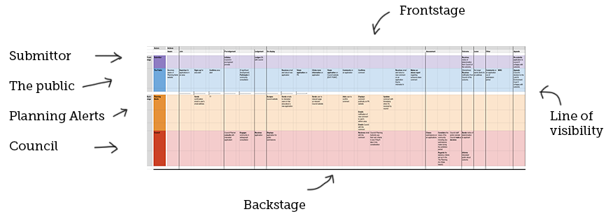
Some columns – to mark out the stages of the service in chronological order
Some rows – to mark out the activities of the main four actors (1. the submission, 2. the public, 3. PlanningAlerts and the 4. council/planning authority)
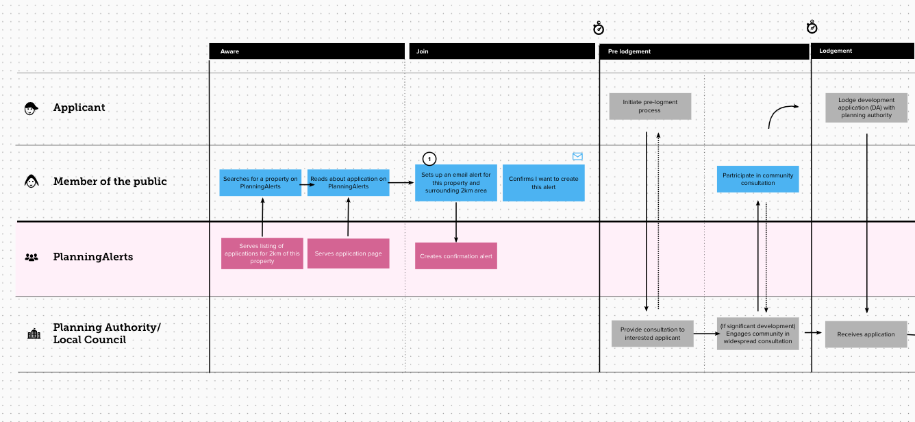
To fill out the frontend experience (the parts visible to the user) I pretended I was a user (a legit technique thank you) and used the live service, documenting as I went. I then sat down with Matthew to document things that were happening in the backend processes that users couldn’t see.
Here’s a snapshot of the Service Blueprint showing it’s sections:
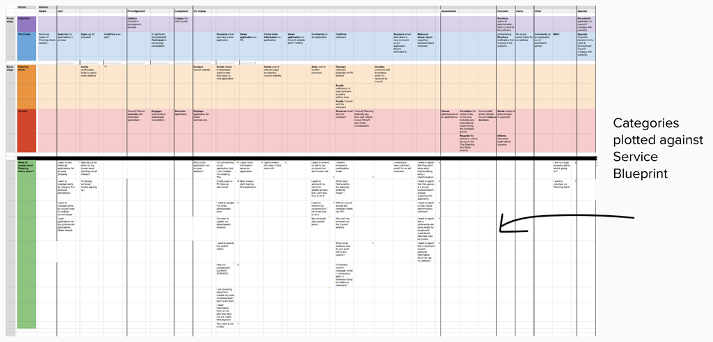
Categorising is a skill
Done. Phew. Came out alive and brain not melted. Now I could start categorising and plotting emails against the map. One bonus benefit of taking this approach would mean I’d be able to capture a bit of insight based on volume – noticing just how many of the same requests were occuring. At this point I still didn’t know exactly what I would learn but I knew it would come out in the wash if I trusted the process.
Category creation itself requires great skill. Archivists etc know this well. If you do this bit without deep consideration, you can set yourself up to miss important learnings down the track. The job here was for me to unpack a user’s underlying need in each email, which isn’t always immediately obvious or stated upfront. I also need to articulate it in a fair and neutral language. This deserves a bit of time.
Here’s some examples of categories I created:
- I want to see historical applications for an area /property
- I want to view/get alerts by council area
- I’m having technical trouble signing up
- I want to know why this application is not on your website?
- I want to amend or add to my comment but don’t know how
- What does “delivered to the planning authority” mean?
- Why isn’t my comment on the Council website?
- Why isn’t my comment on the Council website?
- I want to report a rude/ racist/ discriminatory comment
- I am no longer receiving alerts, what’s going on?
Here’s a snapshot of the Service Blueprint showing the categories plotted along it:
Oh look, incidental value
At this point I did a bit of a shareback with the PlanningAlerts crew to discover that quite apart from any specific learnings, the organisation gets a kick out of having their service mapped for the first time. We recognise this as a separate and highly valuable asset. Even without the emotional user content of a Customer Experience Map, this artefact can enable easier conversations about the service in lots of ways.
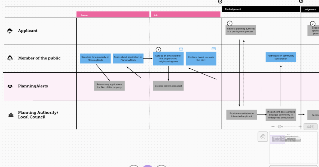
As a result, I took some time to do a slightly more polished and simplified version of the map. Upgrades include icons, numbering and arrows.
The simplified version looks like this:
Ok but what did we learn?
After categorising two months of inbox enquiries, it was hard not to ignore the story showing up in the volume spikes. While a characteristic such as volume is usually the domain of quantitative analysis, it did at least point me at where some of the biggest tension points might sit in the journey. Here’s 3 big volume points where a lot of email was generated to PA.
Learning #1: Receiving an alert
Getting an alert from the service, puts it front of mind and user will often undergo an assessment of worth
When a user (service subscriber) receives a email alert from PlanningAlertsregarding a new DA in their area, we know that generates a whole bunch of traffic to the website, but through the inbox analysis it also appeared to act as a trigger for a user to adjust their preferences with the service. The two biggest examples being – asking to be unsubscribed (exiting the service) and asking how to change their search location (making the service more useful).
Learning #2: Publishing a comment
Only after a user publishes a comment can they asses if they’re happy with it
Another noticeable volume of enquiries occurred right after a user makes a comment on a development application. This was mostly about needing technical support with wanting to modify their comment. An early theory on what’s happening here is that once a user sees their comment published in the public domain in cold hard internet print, they immediately have feelings about wanting to modify it – be it to be more anonymous or alter the tone or language.
Big email point #3: Abuse reports
Abuse report messages are very different from everything else, and require much sensitively in their handling
Following along chronologically, the third point in the journey where planningalerts.org,au receives a lot of email is where users are sending an abuse report to the service, regarding a public comment. Of the three groups, this is by far the most fiery in nature, users are feeling an injustice has occurred and they’re wanting that to be addressed. The careful response to these type of emails by planningalerts requires a different skillset from the more technical support stuff.
What next?
From here, the next steps of taking this work further could look like:
- Undertake more analysis increasing the time span from 2 months to perhaps 6 months. To level out the data and look for any missed email categories
- Cluster and grouping email categories around user need
- Take each cluster and reframing them as an opportunities
- Tag and prioritise the opportunities against the organisations needs and agendas.e.g quick wins, automation opportunities, deeper inquiry needed, partnership opportunity or encourage greater debate.